Walk into a bustling hawker center or quick-service restaurant in Singapore on any given Friday afternoon, and the scene is almost always the same: a queue snaking past the counter, staff calling out order numbers while simultaneously taking new ones, and customers squinting at a menu board, still deciding, while the line behind them grows. It’s controlled chaos—and for most F&B operators, it’s just any regular day.
Labour costs in Singapore have been climbing steadily, and finding reliable front-of-house staff isn’t getting easier. So more business owners are turning to self-ordering kiosks as a practical fix. But here’s something most buying guides skip over: the screen is just the beginning. What actually determines whether a kiosk pulls its weight, or collects dust near the entrance, is the combination of components behind it, inside it and connected to it.
This post covers every essential component of a self-ordering kiosk in Singapore, so you go in knowing what questions to ask.
The Core Components of a Self-Ordering Kiosk
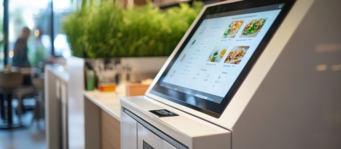
1. Touchscreen Interface
The touchscreen is the most visible part of the kiosk, and it does a lot of the heavy lifting. Size matters. A 21-inch display gives customers enough room to browse a full menu comfortably, while a 15-inch screen can feel cramped when someone’s trying to customise a five-item family order. Beyond size, responsiveness is what separates a smooth experience from a frustrating one. Capacitive touchscreens register taps accurately and hold up well under the kind of repeated, not-always-gentle use that comes with a busy lunch crowd.
Durability is worth thinking about, too. Singapore’s humidity (even indoors where air-conditioning creates condensation cycles) can wear down cheaper displays over time. An IP-rated screen built for commercial environments is a safer long-term bet than one that looked great in a showroom.
2. Multilingual Support
Singapore has four official languages: English, Mandarin, Malay and Tamil, and your customers reflect that mix every single day. A kiosk that only runs in English creates a real barrier for a meaningful chunk of your walk-in traffic. Older customers especially tend to be more comfortable ordering in their mother tongue, and if the interface doesn’t support that, they’ll skip the kiosk entirely and head straight to the counter.
Multilingual support isn’t a premium feature here. It’s table stakes. And when you’re evaluating options, go beyond just asking whether multiple languages are available. Check the quality of the translations. A Mandarin menu full of awkward phrasing or a Malay interface with mistranslated dish names will do more harm than good.
3. User-Friendly UI/UX Design
Good interface design is basically invisible. Customers just move through the ordering process without thinking about it. Bad design, though? You’ll hear about it from customers, from staff and eventually from your sales data.
If a customer has to tap through five screens to add one item to their cart, they’ll give up. If the checkout button is buried under a promotional banner, orders get abandoned. The best kiosk interfaces are built around one principle: get the customer from “I’m hungry” to “order confirmed” with as few steps as possible. Large item images, logical category groupings and a clearly visible cart at all times go a long way. A confusing UI doesn’t just frustrate people, it wipes out the efficiency gains you bought the kiosk to create.
4. Menu Browsing and Selection
How customers browse your menu shapes the entire ordering experience. A well-built system organises items clearly by category, displays real food photography and loads fast even when 10 transactions are happening simultaneously. But the less glamorous part, the part that actually keeps operations running smoothly, is real-time menu syncing with your POS.
If an item sells out at 12:45pm, it should disappear from the kiosk at 12:45pm. Not at 1:30pm when someone finally updates it manually. Nothing frustrates a customer quite like completing a full order, paying, and then being told later that their main item isn’t available. That one moment can undo a lot of goodwill.
5. Product Customisation Options
Singapore F&B menus are rarely simple. Your customers want their noodles dry, their bubble tea at 20% sugar, and their set meal with a soup swap. A kiosk needs to handle that gracefully through modifier screens that prompt customers to select spice levels, add-ons, portion sizes and dietary preferences without making the whole process feel like filling in a government form.
This is where a lot of cheaper kiosk solutions fall apart. If the customisation flow is buried too deep or only supports basic add/remove options, customers default to ordering at the counter anyway. And at that point, you’ve paid for a kiosk that’s just a menu display.
6. Upselling and Promotions Display
Here’s one of the more quietly powerful things a kiosk does well: consistent upselling, without any awkwardness. A staff member might hesitate to suggest an upgrade for the 20th customer in a row. But the kiosk never hesitates.
A well-configured system can prompt customers to add a drink, upsize their meal or grab a limited-time bundle deal right at the moment they’re most likely to say yes, which is just before they tap “confirm order”. Promotional banners for seasonal offers or combo deals can also run on the idle screen between transactions. The key is making these feel like helpful nudges rather than aggressive push notifications. That’s a configuration and content decision, not just a feature checkbox.
7. Membership and Loyalty Login/Identification
Repeat customers are where most F&B businesses actually make their money, and your kiosk should support that relationship, not bypass it. Customers should be able to identify themselves quickly via QR code scan, phone number entry, or a membership card tap. Once identified, the kiosk pulls up their accumulated points, applies any available rewards automatically, and can even surface saved preferences or past orders.
This kind of integration keeps regulars engaged with your loyalty programme without requiring any extra effort on their part. Make sure any kiosk you’re considering can connect to your existing CRM or loyalty platform directly, not through a clunky workaround that needs manual reconciliation at the end of the day.
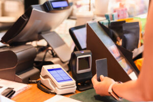
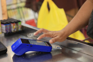
8. Contactless Payment Options
Singapore is one of the most cashless-forward markets in Asia, and your kiosk’s payment module needs to match that reality. Customers will expect PayNow, NETS, Visa, Mastercard, GrabPay, Apple Pay and likely a few others, depending on your customer base. Under the Monetary Authority of Singapore’s regulatory framework, payment systems need to meet specific compliance requirements, which is one reason it matters to choose a vendor with a locally tested and certified payment module, not just a generic imported one.
Build in redundancy too. If one payment rail goes down mid-service and your kiosk only supports two options, you’ve got a problem. A kiosk with broad payment coverage handles those moments without missing a beat.
9. QR Code Scanning
QR scanning on a kiosk handles more than you’d think. Customers use it to log into loyalty accounts, redeem vouchers, apply promo codes or access digital menus. It’s a small feature in isolation, but removing friction from these steps adds up across hundreds of transactions a week. Check that the built-in scanner reads codes reliably off phone screens (not just printed paper), since that’s how most customers will present them. A scanner that struggles with digital QR codes will create its own queue at the kiosk.
10. Order Review and Confirmation Screen
This screen shows up right before payment, and it matters more than most people expect. A clean, itemised summary, with each item, every customisation and the total clearly visible, gives customers one last chance to catch a mistake before the order is finalised. That single screen reduces disputed orders, kitchen errors and the “Can you change my order?” conversations that slow down your staff.
Keep it uncluttered. If a customer has to hunt for their total amount on a screen crowded with upsell prompts, the design needs rethinking.
11. Receipt Options (Print or Digital)
Some customers want a printed receipt. Others prefer a digital one sent to their phone. A good kiosk gives them both options. Thermal printers are reliable and cost-effective for high-volume environments, but paper roll consumables add up over time, and someone has to replace them promptly when they run out. Digital receipts via SMS or email reduce that overhead and align with sustainability goals that are increasingly relevant for consumer-facing brands. Factor both the hardware maintenance and consumable costs into your comparison when you’re evaluating options.
12. Accessibility Features
Singapore’s population is ageing, and inclusive design is moving from a nice-to-have to a non-negotiable business consideration. Accessibility features on a kiosk include adjustable screen height or tilt angles for wheelchair users, larger font options, high-contrast display modes and audio assistance for visually impaired customers. These features widen the pool of people who can use your kiosk independently and signal to customers that your business is designed for everyone, not just the average user. Look for vendors who build this in as a standard feature rather than an optional upgrade.
13. Queue Number/Order Status Display
Once payment clears, the next question every customer has is: when is my order ready, and how will I know? A queue management or order status integration answers that cleanly. The kiosk issues a queue number, which shows up on a display near the collection counter when the kitchen is ready. Customers can find a seat instead of hovering near the counter. Staff aren’t calling out names across a noisy dining room. Plus, the whole pickup process moves faster because nobody’s blocking the counter “just in case” their number gets missed. For high-volume F&B operators, this is one of the clearest and most immediate efficiency wins in the entire kiosk setup.
14. Branding and Visual Design
A kiosk that looks like it belongs to every restaurant and none in particular misses an opportunity. If a customer walks up to a generic screen in a generic housing with a generic colour scheme, the experience feels transactional at best. Your kiosk interface should carry your brand: your colours, your logo, your photography, your visual personality. The physical enclosure matters too. A well-designed housing that matches your outlet’s aesthetic looks intentional and professional, and it quietly signals to customers that you’ve put thought into the experience. That’s brand trust, and it’s worth protecting.
15. POS Integration
Last but not least, POS integration is what holds everything together. Without it, the kiosk is an island; collecting orders that someone still has to manually key into the system, which defeats the purpose of having an automated ordering system in the first place. Proper integration means kiosk orders flow directly to the kitchen display or printer, inventory updates in real time, sales data feeds into your reports automatically, and the menu stays in sync with what’s available. When comparing self-ordering kiosk options in Singapore, the depth and reliability of POS integration should sit right at the top of your checklist. Everything else depends on it.
Discover the 10 pain points a POS system erases from your F&B operations.
How the PSG Scheme Makes This More Accessible
The upfront cost of a self-ordering kiosk setup is a real consideration for most SMEs, and that’s where the Productivity Solutions Grant (PSG) comes in. Eligible Singapore-registered businesses can receive funding support for pre-qualified POS and retail management solutions. Suntoyo is a pre-qualified PSG vendor under that scheme.
In practical terms, that means qualifying businesses can offset a meaningful portion of the adoption cost through the grant. If you’re a Singapore SME in F&B or retail, it’s worth checking your eligibility before making any purchasing decisions. The PSG was built precisely for this kind of operational upgrade.
The Right Kiosk Is More Than a Screen
A self-ordering kiosk earns its place through a combination of components that work together behind the interface. The screen draws customers in, but it’s the POS integration, payment coverage, multilingual support, customisation depth and loyalty connectivity that determine whether the system actually makes your operation run better or just looks like it should.
Suntoyo has been helping Singapore businesses build reliable, well-integrated kiosk and POS setups for years. If you’re sorting through your options, or thinking about a PSG application, reach out to our team. We’ll give you a straight answer on what makes sense for your business.